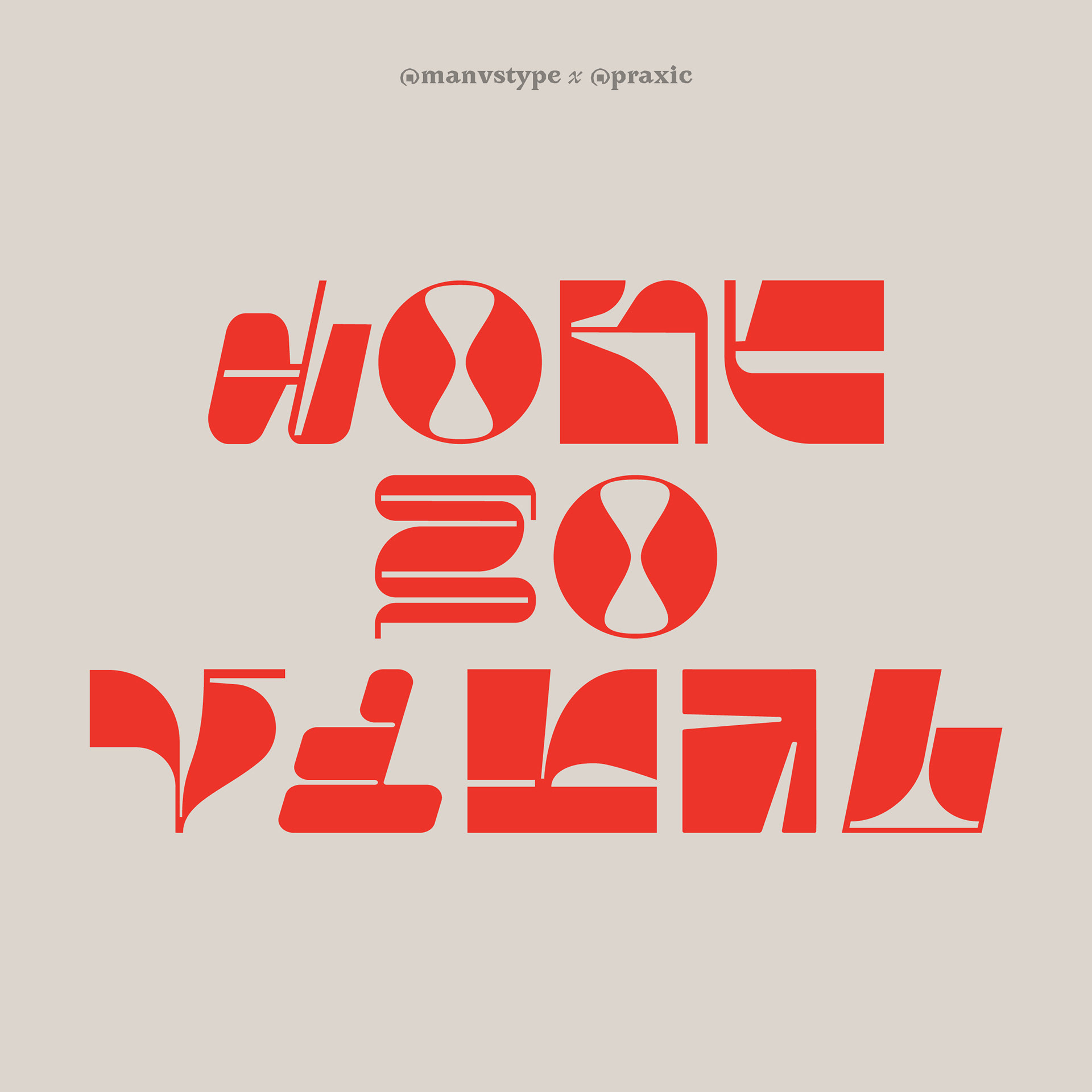
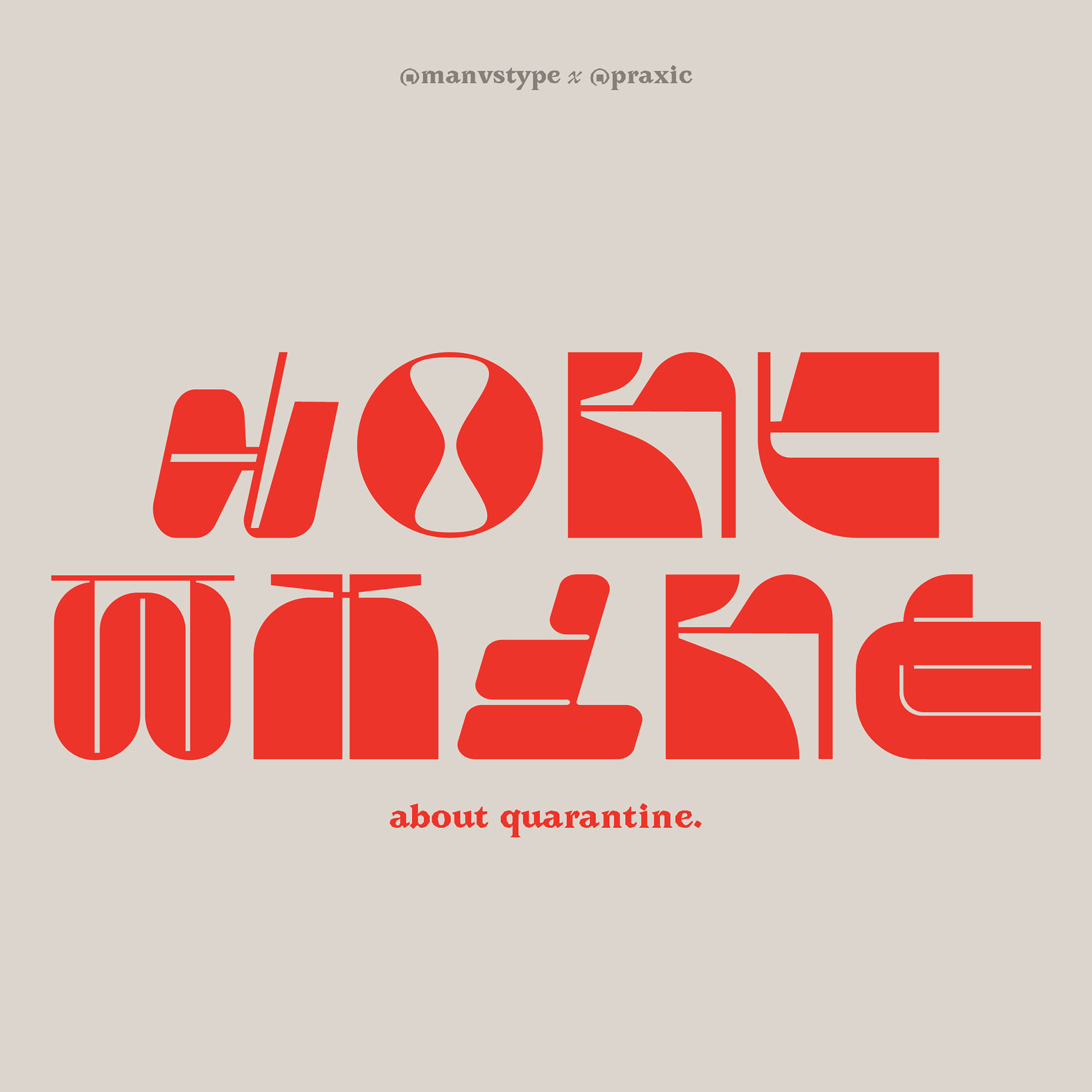
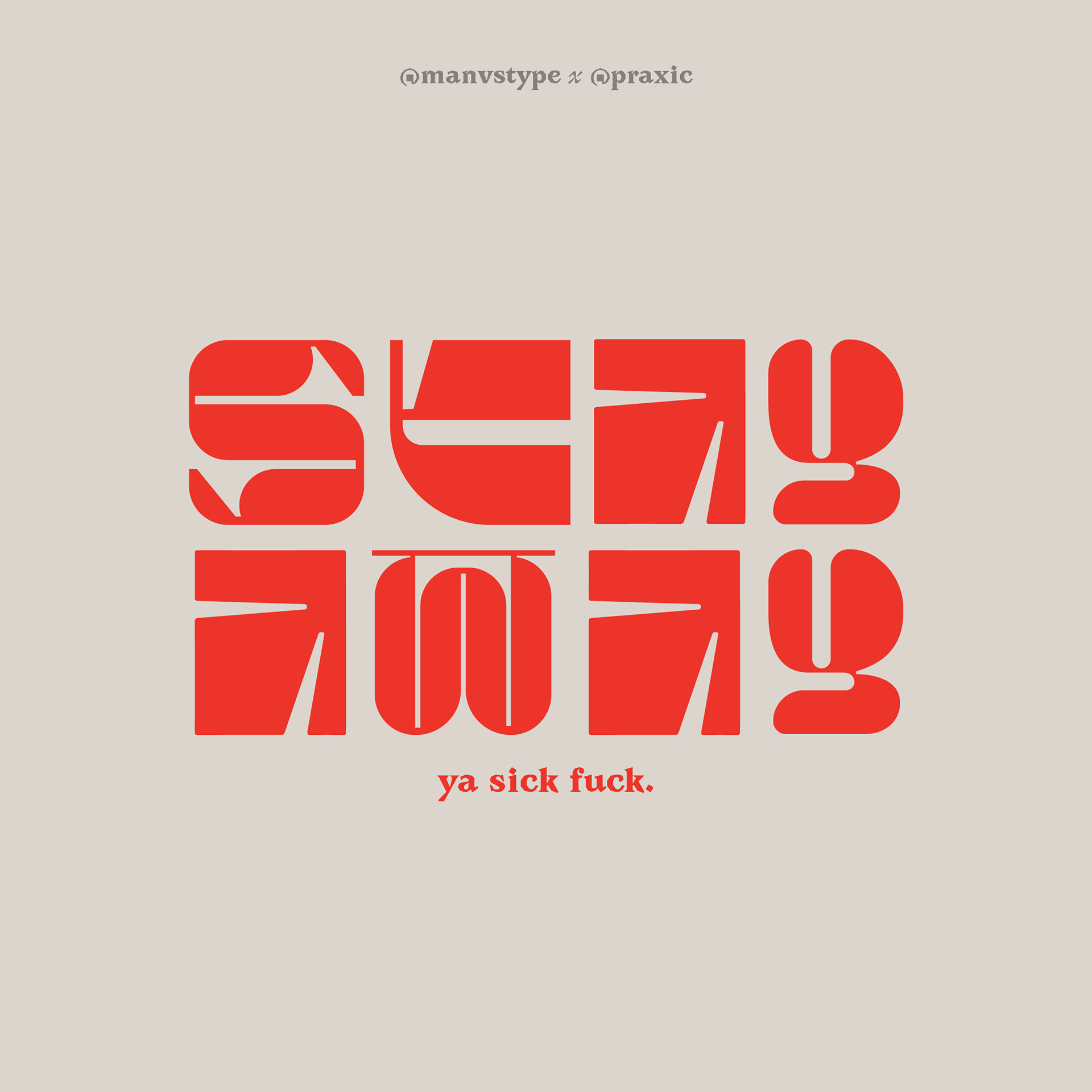
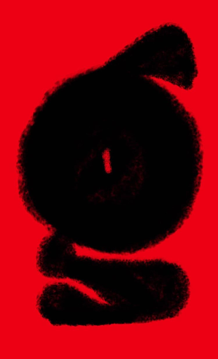
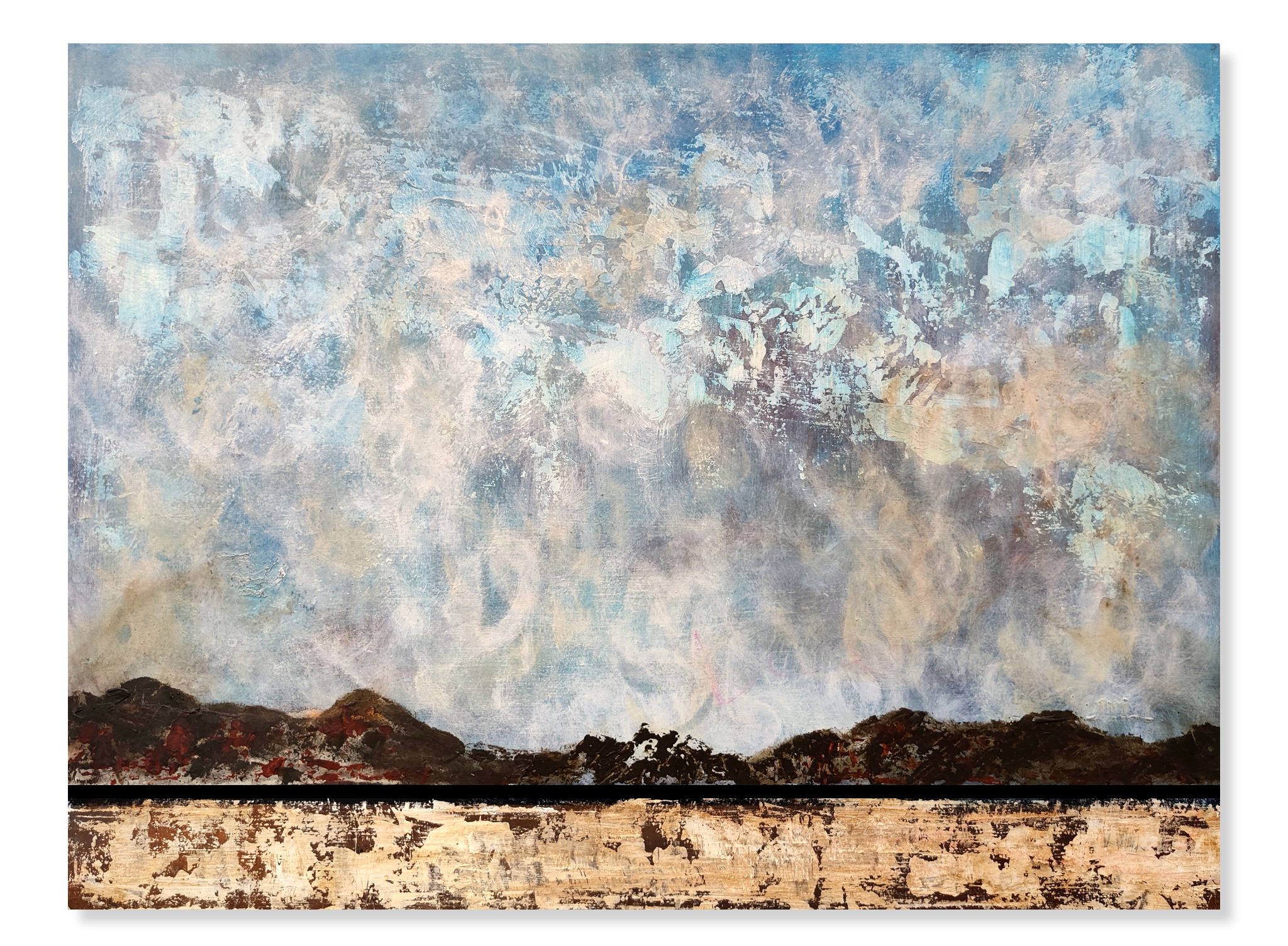
Manav Dhiman is no ordinary graphic designer. He shares a deep relationship with the ‘forms’ present around him, be it the big cement walls or a toothbrush. You will find him appreciating the most ordinary things in life and philosophizing on the most mundane aspect of human behavior like ‘sitting’. His work brings forward the importance of ‘form’ and everything that it contains. Abstract art can be difficult to deliver, but Dhiman believes that abstract art is the most reliable form of self-expression. He believes in making a piece more ferociously pleasing to the eyes. At the same time, he does not shy away from developing more complicated forms that demand a second thought and require attention. He believes that a form that takes time to sink into the viewer’s mind makes a lasting expression as it flickers and plays with the thoughts and images as a viewer tries to make sense of it. His philosophy is rather simple when it comes to creating art, he says ‘just go with what you like and keep playing around with it till you are satisfied’. He also believes in taking the time to learn and experiment with different mediums and forms. He believes in involving the viewer in his art as the viewer tries to “figure out the final piece of the puzzle” and he believes engagement of this kind leaves a lasting impact. His series of work on English alphabets are really fantastical, peculiar, and stunning. Something that started off only as a leisurely doodle and unwinding activity turned into a significant series called ‘Letters’. These alphabets melt and rise like a hot Delhi summer day and consume the viewer. The alphabets sometimes seem to create different moods and evoke intense emotions that one might be hiding. His work seems to anthropomorphize the alphabets in a way that they seem sad sometimes and sometimes curious. Sometimes they seem to dance around drunk on life and sometimes just caught in a moment of leisure. He says that he wishes to “emphasize a part of a letter that isn’t usually emphasized by exaggerating it” to create a form of an alphabet from a unique perspective. His designs are never fixated to a particular meaning or idea but heavily thrive of the viewer’s imagination invoked through visual forms.
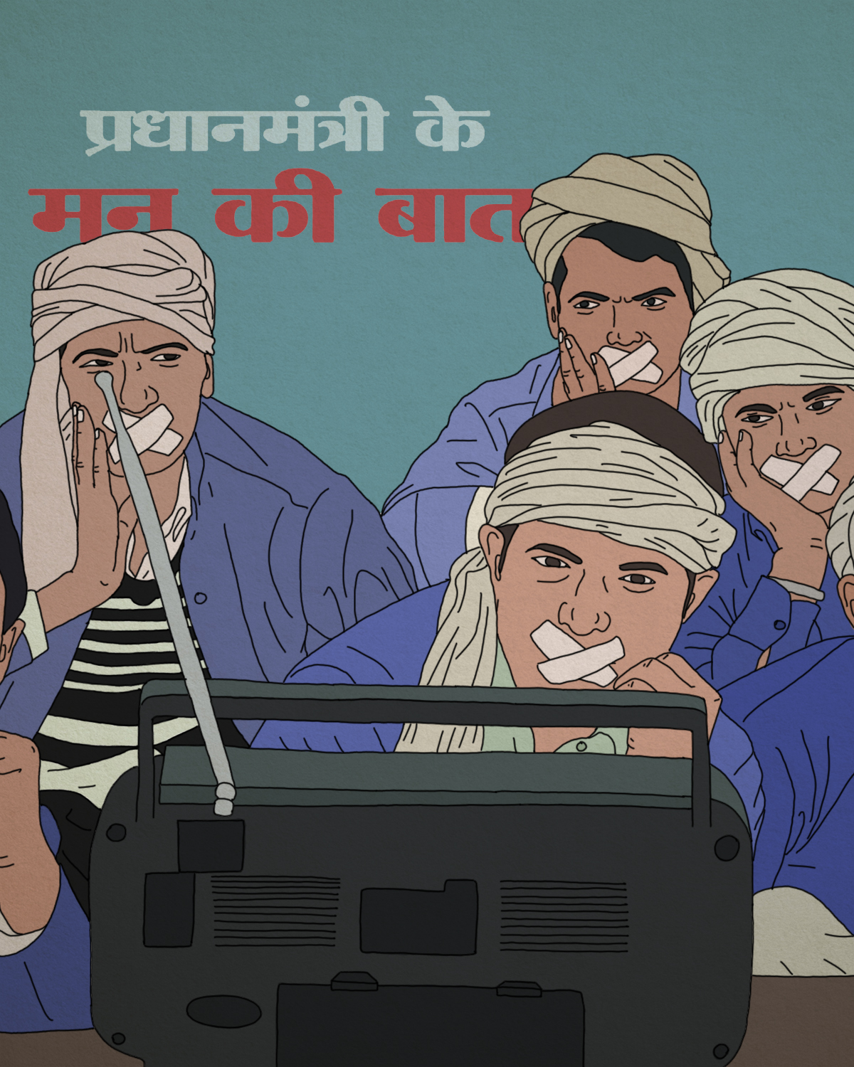
The importance of mundane is heavily emphasized in his art. He believes that “boredom” is an important phenomenon as it helps us to disconnect from the world and gives us a moment to reflect on things we usually miss out. He also believes that life is lived in real-time and it cannot be “fast-forwarded” and it is important to find serendipity in it and not take it for granted. His relationship with the Devanagari script is rather special. In a country like India where English is considered a supreme language, Manav wishes to reconnect with Devanagari and explore it in other ways. He says, “There is a lot in Devanagari still left to be explored” and he believes that it needs to be viewed in a different light where it can be “street-styled”. There is something very fascinating about his forms that create a visible liveliness as one tries to drift through life and Manav’s fantastical forms catch the eye.
All Artworks by Manav Dhiman.
Text by Mariyam Fatima.


Congratulations..great work..
Nice manav we r proud of u